Friday Favourite Website #5 - Keith Homemade Cakes

09 Mar 2012
Written by MJ Meyer

We always receive questions about good web design, and what it looks like. So we decided to start a new series of posts, our Friday Favourites! Showcasing what we believe is the best web design around the world...

About Keith Homemade Cakes

"Established for over 50 years, Keith Home Made Cakes still delivers a range of speciality cakes that is ideal for entertaining guests, a family treat or a little self indulgence. Our full team of chefs and friendly staff take pride in providing attentive service while discussing your needs for your special cake. While small we are big in service and satisfaction."

View Keith Homemade Cake's Website

What We Love About Their Website

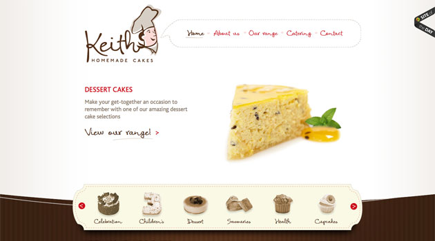
Once again, it blows me away to see what people can do! What a beautiful site. It's perfectly designed to their business, and you just get the bakery feel when looking at the site.

The homepage slide show has some beautiful high quality images that just make my mouth water. If I was located in Australia, I would probably be on the phone right know ordering some cakes. That's what powerful and professional design does! It captures you from the minute you land on the site!

Also, their use of gradients and textures just finish everything off brilliantly!

What do you think? Like their website? Don't like it? Tell is about it in the comments below...

View Comments

Friday Favourite Website #5 - Hello Somebody

02 Mar 2012
Written by MJ Meyer

What's Friday Favourite?

We always receive questions about good web design, and what it looks like. So we decided to start a new series of posts, our Friday Favourites! Showcasing what we believe is the best web design around the world...

About Hello Somebody

"Moving forward as an organization, we are committed to more than feeding. We believe education is the key to put an end to the poverty and hunger cycle. Our Mission is to feed and educate children, by providing an avenue of knowledge, in order to break the cycle of poverty and hunger within their generation."

View Hello Somebody's Website

What We Love About Their Website

This website is just beautiful. I really love minimal designs. It's amazing how something simple can be so beautiful.

Lots of times we get clients that want to go over the top and want to really try and squeeze in every bit of possible detail (don't worry, we still love you), but this is a stunning example of how simplicity can really portray a message! And what a good message to portray!

The use of images is also stunning. But once again, this is what a minimal design allows you to do. You can use beautiful high quality images, without any other background or website elements distracting from it.

Go and have a look at their website and tell us what you think. Maybe you can even support their good cause...

What do you think? Like their website? Don't like it? Tell is about it in the comments below...

View Comments

Friday Favourite Website #4 - Master Grinding

09 Dec 2011
Written by MJ Meyer

What's Friday Favourite?

We always receive questions about good web design, and what it looks like. So we decided to start a new series of posts, our Friday Favourites! Showcasing what we believe is the best web design around the world...

About Master Grinding

"We're dedicated to our local customers here in New Jersey and the Greater New York area. Hundreds of restaurants, pizza shops, cafeterias, delis, supermarkets, meat cutters and plenty of other food service professionals know they can always depend on Master Grinding. Plus, we continue to have individuals stop by the shop to get their personal knives sharpened or check out our great cutlery and restaurant supplies."

View Master Grinding's Website

What We Love About Their Website

I've always had a soft spot for black in Web Design. Especially websites that showcase a product. The black with the crisp image of the knife just makes it pop. Another thing to look out for is their subtle use of gradients. It's really done well and gives the website a very modern feel.

Most importantly though, when opening the site for the first time, there's no guess work as to who thee are or what they do. I can tell what they're about within the first 5 seconds. Good for keeping your bounce rates low and getting your visitors to stay longer!

My only critique

On the inner pages they have some code that's loading in from an external source. Some kind of SEO tracking software. This takes more than a minute, if not longer, to load causing their tabs to break. Other than that I can't really find anything drastically wrong...

What do you think? Like their website? Hate it? Tell is about it in the comments below...

View Comments

Friday Favourite Website #3 - Lanikai Properties

02 Dec 2011
Written by MJ Meyer

What's Friday Favourite?

We always receive questions about good web design, and what it looks like. So we decided to start a new series of posts, our Friday Favourites! Showcasing what we believe is the best web design around the world...

About Lanikai Properties

A full-service real estate firm located in Oahu, Hawaii, Lanikai Properties offers experience and expertise to buyers and sellers of Hawaiian homes, condos, and other residential properties and is owned by professional Realtor®, Allison Green .

View Lanikai Properties Website

What We Love About Their Website

You should know by know we're suckers for detail and boy is there some stunning detail in this website. It's beautiful, clear and to the point. From opening the website you can clearly see they're a real estate company and one in a stunning location–Hawaii!

If the colours didn't give it away then I really don't know. It just resonates Hawaii with the blue, green and orange colour scheme. The menus that are all askew gives you a feeling of easy going and freedom. You know the "kick of your shoes and just relax" feeling.

Just one teeny tiny little thing... I just don't like how their newsletter subscription is tucked away right at the bottom corner of the website! I barely saw it. Otherwise I love their website and feel its accomplished the goal. Making me want to live there! So who's coming with?

What do you think? Like it? Hate it? What would you improve? Tell is about it in the comments below...

View Comments

Friday Favourite Website #2 - Caffe Uno

25 Nov 2011
Written by MJ Meyer

What's Friday Favourite?

We always receive questions about good web design, and what it looks like. So we decided to start a new series of posts, our Friday Favourites! Showcasing what we believe is the best in web design around the world...

About Caffe Uno

It's all in the name really. But they say it best: "Caffè Uno is the perfect place to enjoy great food & drink throughout the day." They have a few Cafe's around the UK.

View Caffe Uno's Website

What We Love About Their Website

Wow. I was really blown away when I saw this design. The subtle use of textures, especially the grey brick texture truly makes it stand out, and yet it still has a very clean look and feel. Even though there are quite a lot of textures used, they all play together well.

Notice the beautiful images used on the homepage, well everywhere for that matter. I can't stress this enough, beautiful images just make a design extraordinary! If you're looking to have a website designed , make sure you either hire a very good photographer, or get quality images from a source like istockphoto.com.

On a final note, the functionality on this website is absolutely awesome. Have a look at their menu page. The layout of all the items, as well as the different courses is really well thought out, easy to read, and just a pleasant experience.

There are so many other things I love about this site, but I'll leave them for you to spot!

Tell us what you love about this website, or maybe even don't like in the comments below...

View Comments